
Clearer first impression
A front page and structure that makes the company feel more current, more trustworthy and easier to understand.
Website optimization
This is one of the clearest use cases for website optimization: a company site that still works, but feels older, more generic or less trustworthy than the company itself.
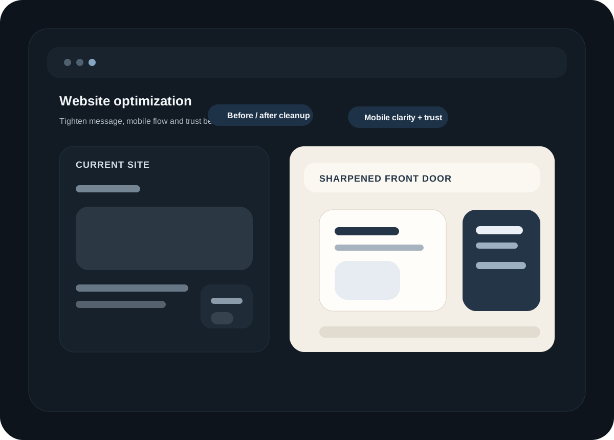
The company has grown, but the website still feels older, thinner or less trustworthy than the business itself.
The mobile experience feels weak, uneven or clearly behind what people expect now.
The current site works technically, but it no longer represents the company properly.
The next step is not a giant rebuild, but a clearer, more modern and more credible front door.
What usually changes
A front page and structure that makes the company feel more current, more trustworthy and easier to understand.
A calmer and more deliberate visual direction that looks more designed and less generic.
Spacing, hierarchy and interaction that feel more thought-through on smaller screens.
Focus on the changes that actually make the site better instead of turning everything into a huge project.
How we approach it
We look at the structure, message, mobile experience and overall trust level of the current site.
Sometimes that means a meaningful redesign. Sometimes it means tighter copy, stronger layout and better hierarchy.
The goal is a site that feels more modern and more credible without becoming overbuilt or overly flashy.
Good fit
This usually works best when the business itself is solid, but the current website is dragging down the first impression.
The right next step is often not a total reinvention. It is a calmer, clearer and better executed version of what should already be there.